Green
Mapped: Carbon Dioxide Emissions Around the World
Article/Editing:
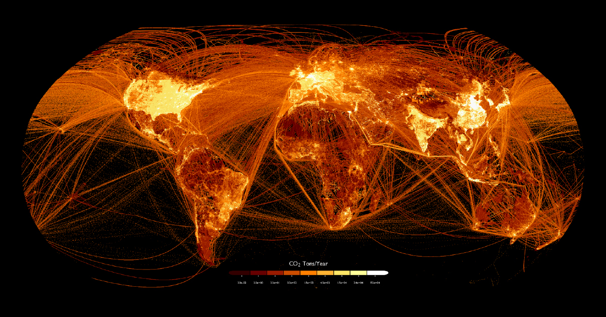
Click to view this graphic in a higher-resolution.
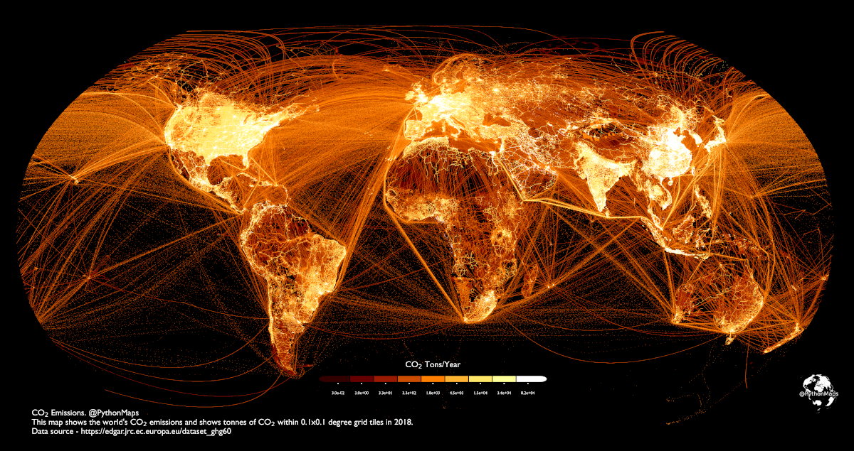
Mapped: Carbon Dioxide Emissions Around the World
According to Our World in Data, the global population emits about 34 billion tonnes of carbon dioxide (CO₂) each year.
Where does all this CO₂ come from? This graphic by Adam Symington maps out carbon emissions around the world, using 2018 data from the European Commission that tracks tonnes of CO₂ per 0.1 degree grid (roughly 11 square kilometers).
This type of visualization allows us to clearly see not just population centers, but flight paths, shipping lanes, and high production areas. Let’s take a closer look at some of these concentrated (and brightly lit) regions on the map.
China, India, and the Indian Ocean

As the two most populated countries and economic forces, China and India are both significant emitters of CO₂. China in particular accounts for about 27% of global CO₂ emissions.
And looking at the oceans, we see how much shipping adds to emissions, with many shipping lanes east of China clearly outlined as well as the major Indian Ocean lane between the Strait of Malacca and the Suez Canal.
The United States and Central America

The United States is one of the world’s biggest carbon emitters. While other countries like Qatar and Saudi Arabia technically have higher emissions per capita, their overall emissions are relatively low due to smaller populations.
Across the U.S., the most brightly lit areas are major population centers like the Boston-Washington corridor, the Bay Area, and the Great Lakes. But also lit up are many of the interconnecting highways linking all these population centers, even in the less-populated middle of the country.
With so much traffic in and out of the U.S., the oceans become a murky mix of shipping and flight paths. To the south, very clearly visible is the major concentration of people around Mexico City and the traffic flowing through the Panama Canal.
South America’s Network of Emissions
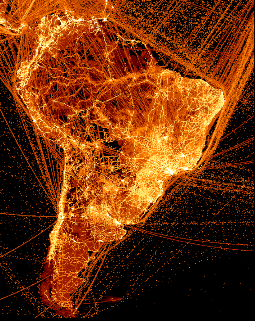
Like the other regions, some of South America’s most populated areas are also the biggest emitters, such as São Paulo and Rio in Brazil and Buenos Aires in Argentina. This map also highlights the continent’s rough terrain, with most of the population and highway emissions limited to the coasts.
However, the cities aren’t the only big emitters in the region. There are clear lines intersecting the Amazon forest in many sections where cities and roads were constructed, including the economic hub city of Manaus along the Amazon River. Likewise, the oceans have many major shipping lanes highlighted, particularly East of Brazil.
Europe and North Africa
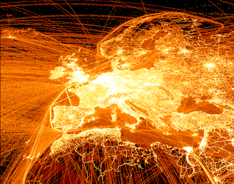
Germany is one of Europe’s biggest carbon emitters—in 2021, the country generated almost 644 million tonnes of CO₂.
Also making an impression are Italy (which is the second-highest CO₂ emitter after Germany) and the UK, as well the significant amount of trade along the English Channel.
Compared to the intricate network of cities, towns, and bustling highways spanning Europe, across the Mediterranean are far clearer and simpler lines of activity in Northern Africa. Two major exceptions are in the Middle-East, where Egypt’s Nile River and Suez Canal are massively lit up, as well as Israel on the east of the sea.
But a more significant (albeit murkier) picture is drawn by the massive amounts of shipping and flight paths illuminating the Atlantic and Mediterranean at large.
Net Zero by 2050
To mitigate the negative effects of climate change, countries around the world have made commitments to reach net-zero emissions.
Imagining the global map of emissions with these commitments in action requires a complete transformation of energy production, consumption habits, transportation infrastructure, and more. And even then, a future generated map wouldn’t be fully dark, as “net-zero” is not equivalent to zero emissions but a balance of emissions and removal.
How might this map of global emissions look in the near and distant future? And what other interesting insights can you generate by browsing the world this way?

This article was published as a part of Visual Capitalist's Creator Program, which features data-driven visuals from some of our favorite Creators around the world.


Environment
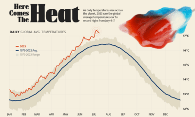
Hotter Than Ever: 2023 Sets New Global Temperature Records
Four days straight in July 2023 set or equaled global temperature records on average.
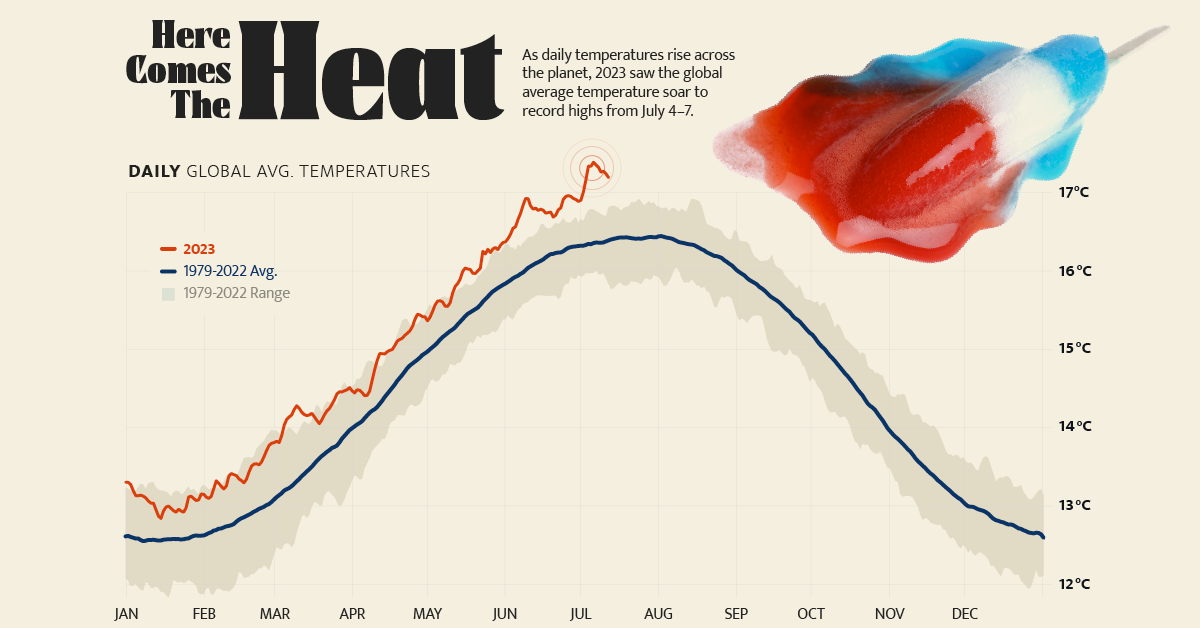
Charting Record-Breaking Monthly Global Temperatures
As local heat records are being broken across the planet, July 2023 also saw the global average temperature soar to an unprecedented 17.2°C (62.9°F).
In fact, according to the U.S. National Oceanic and Atmospheric Administration (NOAA), the four hottest days on record occurred from July 4 to July 7, 2023, breaking the previous record of 16.9°C (62.4°F) set in mid-August 2016.
The above graphic charts the average air temperature at 2 meters above the surface, since 1979, using data from Climate Reanalyzer.
What is Causing Record High Temperatures?
Temperature records were shattered in both 2023 and 2016 as a result of the dual impact of the El Niño climate phenomenon, which causes a significant rise in Pacific Ocean temperatures, and climate change.
Earth’s average global temperature has risen by at least 1.1°C (1.9°F) since 1880, and the pace has significantly increased in the last century alongside the burning of fossil fuels. The majority of the warming has occurred since 1975, with temperatures rising 0.15 to 0.20°C per decade.
According to the NOAA, six of the most recent months of July (typically the hottest month) were among the seven hottest months recorded by average global surface temperature:
| Rank | Hottest Months by Avg. Temp. | Celsius (°C) |
|---|---|---|
| 1 | July 2023* | 17.07°C |
| 2 | July 2022 | 16.75°C |
| 3 | July 2016 | 16.72°C |
| 4 | July 2021 | 16.70°C |
| 5 | July 2002 | 16.67°C |
| 6 | July 2017 | 16.66°C |
| 7 | July 2019 | 16.64°C |
*As of July 12, 2023
Although these figures show marginal increases in the world’s average temperatures, the effects are far more noticeable on a local scale.
In July 2023, temperatures in Texas surpassed those of Northern Africa, as they reached 43.3°C (110°F). Across the Pacific, cities around China used bomb shelters as cooling centers during a 10-day streak of days above 35°C (95°F).
“We are in uncharted territory and we can expect more records to fall as El Niño develops further and these impacts will extend into 2024,”
– Christopher Hewitt, World Meteorological Organization
How to Mitigate Climate Change?
Transitioning to renewable energy sources, reducing or capturing greenhouse gas emissions, and implementing sustainable practices are considered key steps towards slowing climate change.
According to NASA, the future will also require adaptation, reducing our risks from the harmful effects of climate change (such as sea-level rise, more intense extreme weather events, or food insecurity) as well as taking advantage of any potential positive opportunities associated with climate change (such as longer growing seasons and higher yields in some regions).

-

 Markets4 weeks ago
The World’s Biggest Mutual Fund and ETF Providers
-

 Brands2 weeks ago
Brand Reputations: Ranking the Best and Worst in 2023
-
 Environment5 days ago
Hotter Than Ever: 2023 Sets New Global Temperature Records
-
 Datastream4 weeks ago
Can You Calculate Your Daily Carbon Footprint?
-
 Energy2 weeks ago
Who’s Still Buying Russian Fossil Fuels in 2023?
-

 VC+4 days ago
What’s New on VC+ in July
-

 Investor Education4 weeks ago
Visualizing BlackRock’s Top Equity Holdings
-

 apps2 weeks ago
Meet the Competing Apps Battling for Twitter’s Market Share