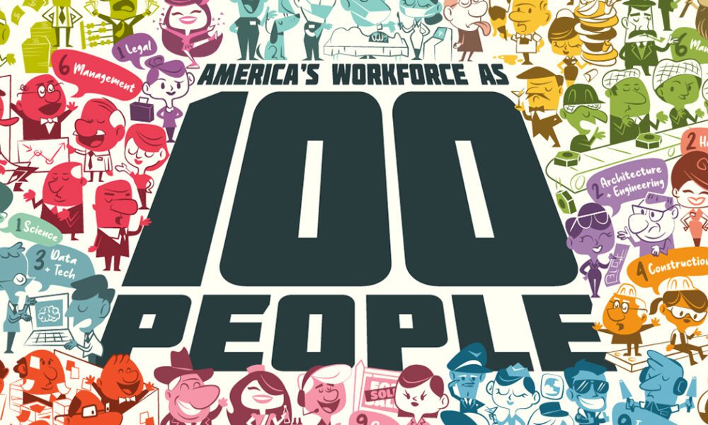

Reimagining all 200 million of the American workforce as 100 people: where do they all work, what positions they hold,...
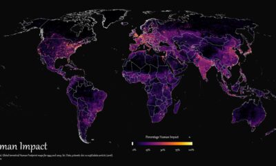

How far has humanity spread, and where haven't we gone? This graphic maps the extent of humanity’s impact on the world from 1993 to 2009.
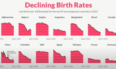

For the last 70 years, birth rates for the 49 most populous countries of the world have fallen sharply, heralding an uncertain future.
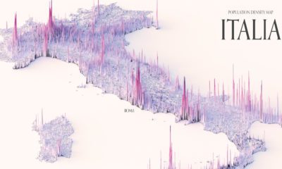

These maps show the population density of several countries, using 3D spikes to denote where more people live.
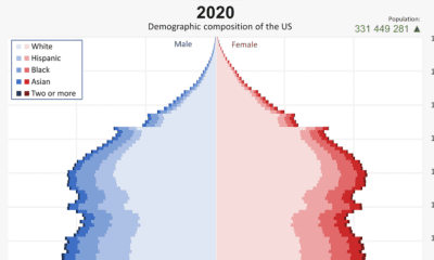

From 1901 to 2020, the U.S. population has changed significantly. This video reveals the change in America's demographics over 100+ years.
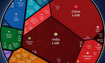

Our population will soon reach a new milestone—8 billion. These visualizations show where all those people are distributed around the world


 Creator Program