Markets
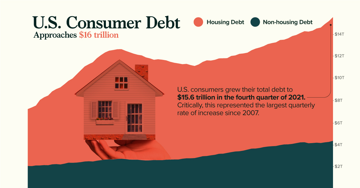
Charted: U.S. Consumer Debt Approaches $16 Trillion


Charted: U.S. Consumer Debt Approaches $16 Trillion
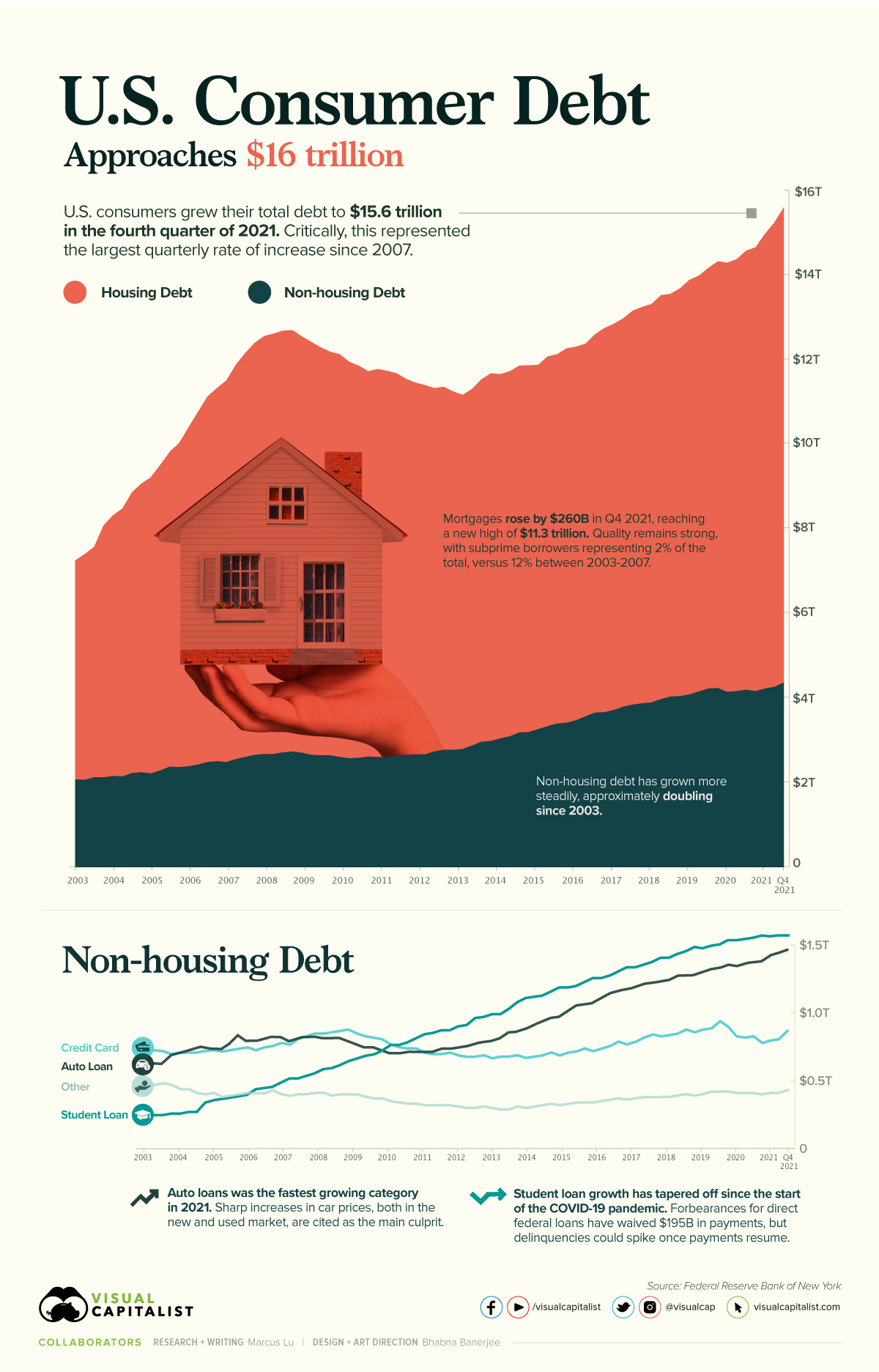
According to the Federal Reserve (Fed), U.S. consumer debt is approaching a record-breaking $16 trillion. Critically, the rate of increase in consumer debt for the fourth quarter of 2021 was also the highest seen since 2007.
This graphic provides context into the consumer debt situation using data from the end of 2021.
Housing Vs. Non-Housing Debt
The following table includes the data used in the above graphic. Housing debt covers mortgages, while non-housing debt covers auto loans, student loans, and credit card balances.
| Date | Housing Debt (USD trillions) | Non-Housing Debt (USD trillions) | Total Consumer Debt (USD trillions) |
|---|---|---|---|
| Q1 2003 | 5.18 | 2.05 | 7.23 |
| Q2 2003 | 5.34 | 2.04 | 7.38 |
| Q3 2003 | 5.45 | 2.10 | 7.55 |
| Q4 2003 | 5.96 | 2.10 | 8.06 |
| Q1 2004 | 6.17 | 2.13 | 8.30 |
| Q2 2004 | 6.34 | 2.12 | 8.46 |
| Q3 2004 | 6.64 | 2.20 | 8.84 |
| Q4 2004 | 6.83 | 2.22 | 9.05 |
| Q1 2005 | 7.01 | 2.19 | 9.20 |
| Q2 2005 | 7.23 | 2.26 | 9.49 |
| Q3 2005 | 7.45 | 2.35 | 9.80 |
| Q4 2005 | 7.67 | 2.34 | 10.01 |
| Q1 2006 | 8.02 | 2.36 | 10.38 |
| Q2 2006 | 8.35 | 2.40 | 10.75 |
| Q3 2006 | 8.65 | 2.46 | 11.11 |
| Q4 2006 | 8.83 | 2.48 | 11.31 |
| Q1 2007 | 9.03 | 2.46 | 11.49 |
| Q2 2007 | 9.33 | 2.53 | 11.86 |
| Q3 2007 | 9.56 | 2.58 | 12.14 |
| Q4 2007 | 9.75 | 2.63 | 12.38 |
| Q1 2008 | 9.89 | 2.65 | 12.54 |
| Q2 2008 | 9.95 | 2.65 | 12.60 |
| Q3 2008 | 9.98 | 2.69 | 12.67 |
| Q4 2008 | 9.97 | 2.71 | 12.68 |
| Q1 2009 | 9.85 | 2.68 | 12.53 |
| Q2 2009 | 9.77 | 2.63 | 12.40 |
| Q3 2009 | 9.65 | 2.62 | 12.27 |
| Q4 2009 | 9.55 | 2.62 | 12.17 |
| Q1 2010 | 9.53 | 2.58 | 12.11 |
| Q2 2010 | 9.38 | 2.55 | 11.93 |
| Q3 2010 | 9.28 | 2.56 | 11.84 |
| Q4 2010 | 9.12 | 2.59 | 11.71 |
| Q1 2011 | 9.18 | 2.58 | 11.76 |
| Q2 2011 | 9.14 | 2.58 | 11.72 |
| Q3 2011 | 9.04 | 2.62 | 11.66 |
| Q4 2011 | 8.90 | 2.63 | 11.53 |
| Q1 2012 | 8.80 | 2.64 | 11.44 |
| Q2 2012 | 8.74 | 2.64 | 11.38 |
| Q3 2012 | 8.60 | 2.71 | 11.31 |
| Q4 2012 | 8.59 | 2.75 | 11.34 |
| Q1 2013 | 8.48 | 2.75 | 11.23 |
| Q2 2013 | 8.38 | 2.77 | 11.15 |
| Q3 2013 | 8.44 | 2.85 | 11.29 |
| Q4 2013 | 8.58 | 2.94 | 11.52 |
| Q1 2014 | 8.70 | 2.96 | 11.66 |
| Q2 2014 | 8.62 | 3.02 | 11.64 |
| Q3 2014 | 8.64 | 3.07 | 11.71 |
| Q4 2014 | 8.68 | 3.16 | 11.84 |
| Q1 2015 | 8.68 | 3.17 | 11.85 |
| Q2 2015 | 8.62 | 3.24 | 11.86 |
| Q3 2015 | 8.75 | 3.31 | 12.06 |
| Q4 2015 | 8.74 | 3.37 | 12.11 |
| Q1 2016 | 8.86 | 3.39 | 12.25 |
| Q2 2016 | 8.84 | 3.45 | 12.29 |
| Q3 2016 | 8.82 | 3.54 | 12.36 |
| Q4 2016 | 8.95 | 3.63 | 12.58 |
| Q1 2017 | 9.09 | 3.64 | 12.73 |
| Q2 2017 | 9.14 | 3.69 | 12.83 |
| Q3 2017 | 9.19 | 3.77 | 12.96 |
| Q4 2017 | 9.32 | 3.82 | 13.14 |
| Q1 2018 | 9.38 | 3.85 | 13.23 |
| Q2 2018 | 9.43 | 3.87 | 13.30 |
| Q3 2018 | 9.56 | 3.95 | 13.51 |
| Q4 2018 | 9.53 | 4.01 | 13.54 |
| Q1 2019 | 9.65 | 4.02 | 13.67 |
| Q2 2019 | 9.81 | 4.06 | 13.87 |
| Q3 2019 | 9.84 | 4.13 | 13.97 |
| Q4 2019 | 9.95 | 4.20 | 14.15 |
| Q1 2020 | 10.10 | 4.21 | 14.31 |
| Q2 2020 | 10.15 | 4.12 | 14.27 |
| Q3 2020 | 10.22 | 4.14 | 14.36 |
| Q4 2020 | 10.39 | 4.17 | 14.56 |
| Q1 2021 | 10.50 | 4.14 | 14.64 |
| Q2 2021 | 10.76 | 4.20 | 14.96 |
| Q3 2021 | 10.99 | 4.24 | 15.23 |
| Q4 2021 | 11.25 | 4.34 | 15.59 |
Source: Federal Reserve
Trends in Housing Debt
Home prices have experienced upward pressure since the beginning of the COVID-19 pandemic. This is evidenced by the Case-Shiller U.S. National Home Price Index, which has increased by 34% since the start of the pandemic.
Driving this growth are various pandemic-related impacts. For example, the cost of materials such as lumber have seen enormous spikes. We’ve covered this story in a previous graphic, which showed how many homes could be built with $50,000 worth of lumber. In most cases, these higher costs are passed on to the consumer.
Another key factor here is mortgage rates, which fell to all-time lows in 2020. When rates are low, consumers are able to borrow in larger quantities. This increases the demand for homes, which in turn inflates prices.
Ultimately, higher home prices translate to more mortgage debt being incurred by families.
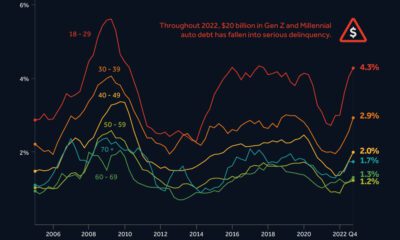
No Need to Worry, Though
Economists believe that today’s housing debt isn’t a cause for concern. This is because the quality of borrowers is much stronger than it was between 2003 and 2007, in the years leading up to the financial crisis and subsequent housing crash.
In the chart below, subprime borrowers (those with a credit score of 620 and below) are represented by the red-shaded bars:
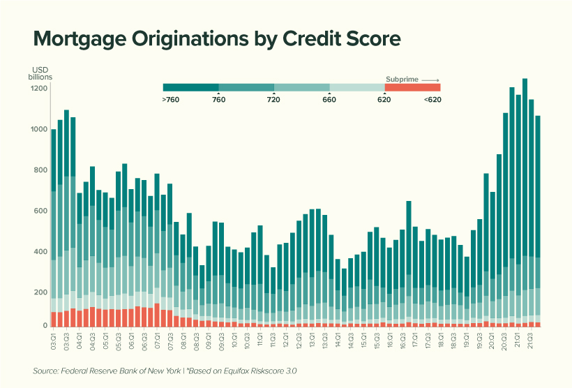
We can see that subprime borrowers represent very little (2%) of today’s total originations compared to the period between 2003 to 2007 (12%). This suggests that American homeowners are, on average, less likely to default on their mortgage.
Economists have also noted a decline in the household debt service ratio, which measures the percentage of disposable income that goes towards a mortgage. This is shown in the table below, along with the average 30-year fixed mortgage rate.
| Year | Mortgage Payments as a % of Disposable Income | Average 30-Year Fixed Mortgage Rate |
|---|---|---|
| 2000 | 12.0% | 8.2% |
| 2004 | 12.2% | 5.4% |
| 2008 | 12.8% | 5.8% |
| 2012 | 9.8% | 3.9% |
| 2016 | 9.9% | 3.7% |
| 2020 | 9.4% | 3.5% |
| 2021 | 9.3% | 3.2% |
Source: Federal Reserve
While it’s true that Americans are less burdened by their mortgages, we must acknowledge the decrease in mortgage rates that took place over the same period.
With the Fed now increasing rates to calm inflation, Americans could see their mortgages begin to eat up a larger chunk of their paycheck. In fact, mortgage rates have already risen for seven consecutive weeks.
Trends in Non-Housing Consumer Debt
The key stories in non-housing consumer debt are student loans and auto loans.
The former category of debt has grown substantially over the past two decades, with growth tapering off during the pandemic. This can be attributed to COVID relief measures which have temporarily lowered the interest rate on direct federal student loans to 0%.
Additionally, these loans were placed into forbearance, meaning 37 million borrowers have not been required to make payments. As of April 2022, the value of these waived payments has reached $195 billion.
Over the course of the pandemic, very few direct federal borrowers have made voluntary payments to reduce their loan principal. When payments eventually resume, and the 0% interest rate is reverted, economists believe that delinquencies could rise significantly.
Auto loans, on the other hand, are following a similar trajectory as mortgages. Both new and used car prices have risen due to the global chip shortage, which is hampering production across the entire industry.
To put this in numbers, the average price of a new car has climbed from $35,600 in 2019, to over $47,000 today. Over a similar timeframe, the average price of a used car has grown from $19,800, to over $28,000.


Markets
The 50 Best One-Year Returns on the S&P 500 (1980-2022)
The highest one-year return among the top S&P 500 stocks from 1980 to 2022 was a staggering 2,620%. Which stocks top the ranks?
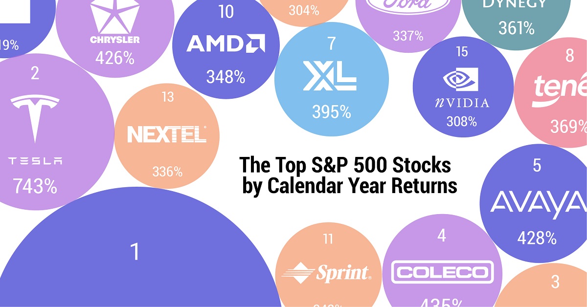
The Top S&P 500 Stocks by Annual Returns
The average annual return of the S&P 500 was 10% from 1980-2022, excluding dividends. Of course, there are some companies that deliver much higher returns in any given year.
In this graphic using data from S&P Dow Jones Indices, we explore the top S&P 500 stocks with the best single year returns over the last four decades.
Ranking the Top S&P 500 Stocks
In order to find the top gainers, S&P took the top 10 best-performing stocks each year and then narrowed that list down to the top 50 overall. They ranked the top S&P 500 stocks by price returns, meaning that no dividends or stock distributions were included.
The best gains were clustered in a few select years, including the 1999 dot-com boom, the 2003 stock market rally, and the 2009 recovery from the Global Financial Crisis. None of the biggest gains happened in 2021 or 2022.
| Rank | Company | Sector | Return | Year |
|---|---|---|---|---|
| 1 | Qualcomm | Information Technology | 2620% | 1999 |
| 2 | Tesla | Consumer Discretionary | 743% | 2020 |
| 3 | DSC Communications | Communication Services | 468% | 1992 |
| 4 | Coleco Industries | Consumer Discretionary | 435% | 1982 |
| 5 | Avaya | Information Technology | 428% | 2003 |
| 6 | Chrysler | Consumer Discretionary | 426% | 1982 |
| 7 | XL Capital (Axa XL) | Financials | 395% | 2009 |
| 8 | Tenet Healthcare | Healthcare | 369% | 2009 |
| 9 | Dynegy | Utilities | 361% | 2000 |
| 10 | Advanced Micro Devices | Information Technology | 348% | 2009 |
| 11 | Sprint | Communication Services | 343% | 1999 |
| 12 | Ford | Consumer Discretionary | 337% | 2009 |
| 13 | NEXTEL Communications | Communication Services | 336% | 1999 |
| 14 | LSI Logic | Information Technology | 319% | 1999 |
| 15 | NVIDIA | Information Technology | 308% | 2001 |
| 16 | Nortel Networks | Communication Services | 304% | 1999 |
| 17 | Etsy | Consumer Discretionary | 302% | 2020 |
| 18 | Genworth Financial | Financials | 301% | 2009 |
| 19 | Micron Technology | Information Technology | 300% | 2009 |
| 20 | NetFlix | Communication Services | 298% | 2013 |
| 21 | Oracle | Information Technology | 290% | 1999 |
| 22 | Western Digital | Information Technology | 286% | 2009 |
| 23 | Network Appliance (NetApp) | Information Technology | 270% | 1999 |
| 24 | Data General | Information Technology | 267% | 1991 |
| 25 | Yahoo | Communication Services | 265% | 1999 |
| 26 | Williams Companies | Energy | 264% | 2003 |
| 27 | Novell | Information Technology | 264% | 1991 |
| 28 | Dynegy | Utilities | 263% | 2003 |
| 29 | Sun Microsystems | Information Technology | 262% | 1999 |
| 30 | PMC-Sierra | Information Technology | 262% | 2003 |
| 31 | Advanced Micro Devices | Information Technology | 259% | 1991 |
| 32 | Dell | Information Technology | 248% | 1998 |
| 33 | Global Marine | Energy | 247% | 1980 |
| 34 | Micron Technology | Information Technology | 243% | 2013 |
| 35 | Best Buy | Consumer Discretionary | 237% | 2013 |
| 36 | Reebok | Consumer Discretionary | 234% | 2000 |
| 37 | Freeport-McMoRan | Materials | 229% | 2009 |
| 38 | Biomet (Zimmer Biomet) | Healthcare | 226% | 1991 |
| 39 | NVIDIA | Information Technology | 224% | 2016 |
| 40 | Gap | Consumer Discretionary | 223% | 1991 |
| 41 | NetFlix | Communication Services | 219% | 2010 |
| 42 | Fleetwood Enterprises (Fleetwood RV) | Consumer Discretionary | 217% | 1982 |
| 43 | National Semiconductor | Information Technology | 217% | 1999 |
| 44 | Dell | Information Technology | 216% | 1997 |
| 45 | Tandy Corp (RadioShack) | Information Technology | 216% | 1980 |
| 46 | Novell | Information Technology | 215% | 2003 |
| 47 | Corning | Information Technology | 215% | 2003 |
| 48 | CB Richard Ellis (CBRE) | Real Estate | 214% | 2009 |
| 49 | AES Corp | Utilities | 213% | 2003 |
| 50 | Expedia | Consumer Discretionary | 212% | 2009 |
Qualcomm was by far the top-performer in any one calendar year window. The company had key patents for Code Division Multiple Access (CDMA) technology, which enabled fast wireless internet access and became the basis for 3G networks.
Its stock took off in 1999 as it shed less profitable business lines, resolved a patent dispute with competitor Ericsson, and joined the S&P 500 Index. At the time, CNN reported that one lucky investor who heard about Qualcomm from an investment-banker-turned-rabbi earned $17 million—roughly $30 million in today’s dollars.
The most recent stocks to make the rankings were both from 2020: well-known Tesla (#2) and lesser-known online marketplace Etsy (#17), which saw sales from independent creators surge during the early COVID-19 pandemic. The dollar value of items sold on Etsy more than doubled from $5.3 billion in 2019 to $10.3 billion in 2020, with mask sales accounting for 7% of the total.
Biggest Gainers in Each Sector
While information technology stocks made up nearly half of the list, there is representation from nine of the 11 S&P 500 sectors. No companies from the Industrials or Consumer Staples sectors made it into the ranks of the top S&P 500 stocks by annual returns.
Below, we show the stock with the best annual return for each sector.
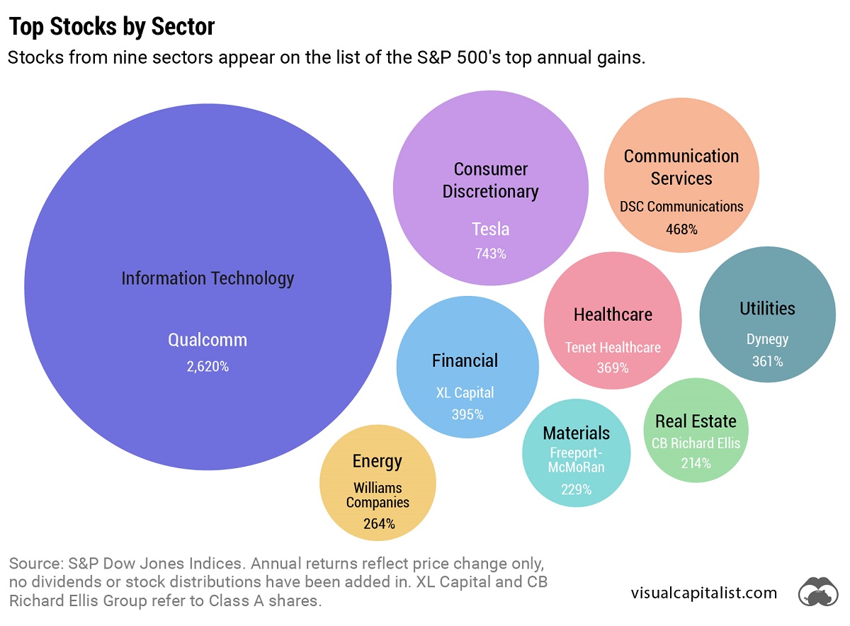
Tesla was the top-performing Consumer Discretionary stock on the list. After meeting the requirement of four consecutive quarters of positive earnings, it joined the S&P 500 Index on December 21, 2020. The company’s performance was boosted by the announcement that it would be included in the S&P 500, along with strong performance in China, and general EV buzz as environmental regulations tightened worldwide.
In the realm of Communication Services, DSC Communications saw a sizable return in 1992. The telecommunications equipment company had contracts with major companies such as Bell and Motorola. Alcatel-Lucent (then Alcatel), a French producer of mobile phones, purchased DSC Communications in 1998.
Serial Success Stories
It’s impressive to make the list of the top S&P 500 stocks by calendar returns once, but there are seven companies that have done it twice.
Some stocks saw their repeated outperformance close together, with Dell making the ranks back-to-back in 1997 and 1998.
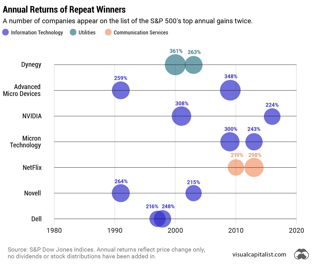
On the other hand, a select few have more staying power. Computing giant NVIDIA topped the charts in 2001 and triumphed again 15 years later in 2016. And this year might be another win, as the company has recently reached a $1 trillion market capitalization and has the highest year-to-date return in the S&P 500 as of July 6, 2023.
-

 Cities6 days ago
Mapped: The Safest Cities in the U.S.
-
 Markets2 weeks ago
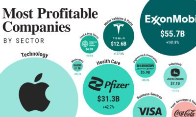
Ranked: The Most Profitable U.S. Companies, by Sector
-

 apps5 days ago
How Long it Took for Popular Apps to Reach 100 Million Users
-
 Markets4 weeks ago
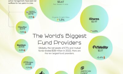
The World’s Biggest Mutual Fund and ETF Providers
-

 Brands2 weeks ago
Brand Reputations: Ranking the Best and Worst in 2023
-
 Environment5 days ago
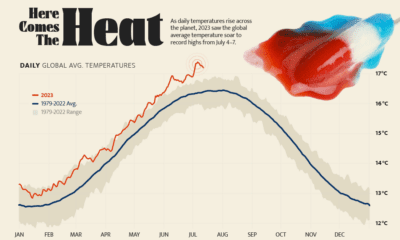
Hotter Than Ever: 2023 Sets New Global Temperature Records
-
 Datastream4 weeks ago
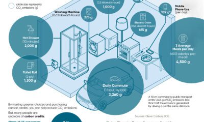
Can You Calculate Your Daily Carbon Footprint?
-
 Energy2 weeks ago
Who’s Still Buying Russian Fossil Fuels in 2023?