

There's more to consider than the price tag when purchasing a house. This ranking reveals the most affordable U.S. cities...
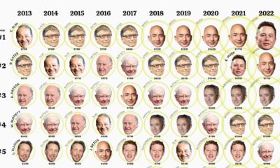

This visualization looks at the ballooning wealth and ranking of the top 10 billionaires over the past 10 years.
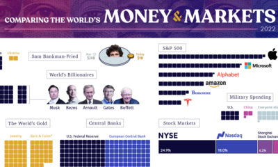

From the wealth held to billionaires to all debt in the global financial system, we look at the vast universe of money and markets in 2022.

This graphic shows income distributions in 16 different countries around the world, using data from the World Inequality Database.
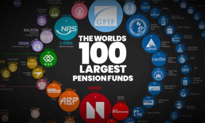

The world’s 100 largest pension funds are worth over $17 trillion in total. Which ones are the biggest, and where are they located?
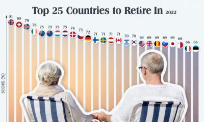

Which countries are the best equipped to support their aging population? This graphic show the best countries to retire in around the world.
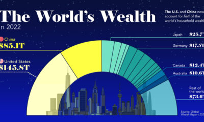

This visualization breaks down how household wealth is distributed around the world. Just 10 countries now account for 75% of total household wealth.
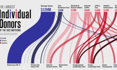

A record-smashing $9 billion has been raised for the 2022 midterm elections. See who the top 10 donors are in this graphic.
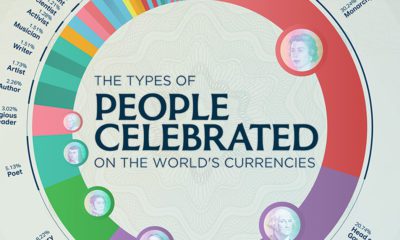

What types of people are celebrated on our money? Here's a look at the various occupations that are featured on international currencies.
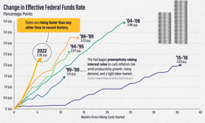

The effective federal funds rate has risen more than two percentage points in six months. How does this compare to other interest rate hikes?
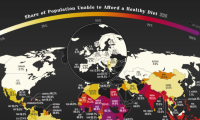

More than three billion people across the globe are unable to afford a healthy diet. See which countries are most affected.


 Creator Program